
Home / Case studies / Latin American airline
Travel and loyalty · Service 03 · Digital Platforms
Latin American airline case study
One sign-in, miles in plain sight and benefits on visual cards.
Specialties: UX · UI · Web development · Responsive product · Loyalty platforms
Project scope
- screen to sign in and register
- 1
- areas redesigned: access, account and benefits
- 3
- journey friction points resolved
- 4
Project facts. Result figures are published only with a source and a date.
The goal
Where we started
Redesign the loyalty program section to improve usability, modernize the interface and streamline sign-in and registration, so managing miles, benefits and the account would be clearer.
The challenge
Friction across the key journeys of the loyalty platform, from sign-in to checking benefits.
- Fragmented sign-in and registration
- Unclear information architecture
- Account data and benefits hard to scan
- An experience that did not reflect a modern travel brand
The approach
How we did it
- Requirements analysis
- Research and insight extraction
- Information architecture restructuring
- Wireframing
- UI discovery and visual design
The solution
Compare the flow: before and after
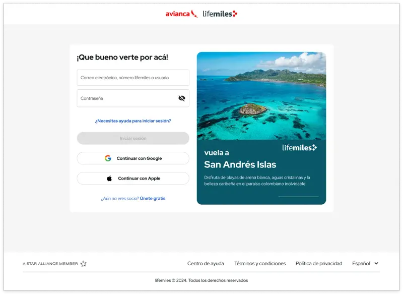
Access on a single screen, with information on one side and context imagery on the other; an account built around miles; benefits on visual cards.
Before
- Fragmented sign-in and registrationfriction
- Unclear information architecturefriction
- Account data and benefits hard to scanfriction
- An experience that did not reflect a modern travel brandfriction
After
- Unified sign-in and registration on a single screen
- Account with accumulated miles highlighted and instant copy
- Benefits in larger visual cards, with better imagery
Impact
What changed
- A more intuitive and accessible loyalty platform
- Clearer navigation and content hierarchy
- Faster sign-in and account management
Other case studies
- Case 01 Retail and e-commerce
Electronics retailer
BeforeLarge catalog with unclear product discoveryAfter Navigation with organized architecture and strategic menus - Case 02 Entertainment and events · marketplace
Suite and ticket marketplace
BeforeSlow event searchAfter Integrated search with filters - Case 04 Food and beverage · analytics
Multinational food company
BeforeDashboards by department and region without a common standardAfter Visual hierarchy and clarified key metrics - Case 05 Financial services · web platform
Real estate financing
BeforeContent changes that took one to two weeksAfter Content updates in minutes, from the Strapi console
Does your case look like this one?
A person on our team will reply.