
Home / Case studies / Electronics retailer
Retail and e-commerce · Service 03 · Digital Platforms
Electronics retailer case study
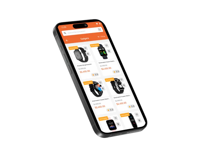
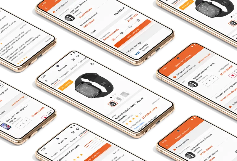
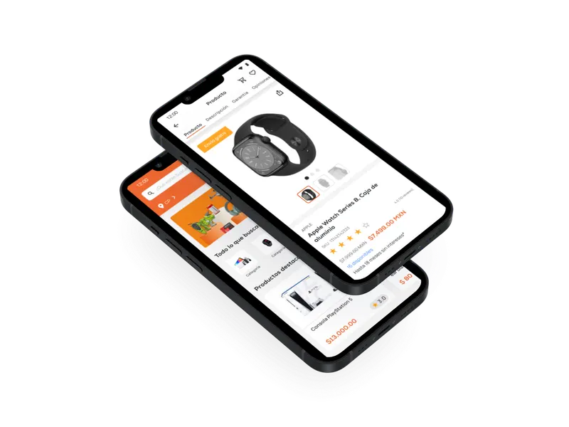
Full-screen checkout, product pages with key data and well-organized categories.
Specialties: UX · UI · Web development
Project scope
- needs from the brief addressed
- 5
- areas redesigned: discovery, product, purchase and promotions
- 4
- stages, from requirements analysis to QA
- 4
Project facts. Result figures are published only with a source and a date.
The goal
Where we started
Design and build an intuitive, well-structured mobile app to sell tech products that improved usability and navigation, supported seasonal campaigns and increased conversions.
The challenge
A large catalog that, on mobile, had to gain clarity, speed and commercial performance.
- Large catalog with unclear product discovery
- Poorly organized categories
- Product information hard to reach
- Checkout to be simplified
- Promotions with low visibility
The approach
How we did it
- Requirements analysis
- Architecture, sitemap and task flows
- UI discovery and visual design
- Development and quality assurance (QA)
The solution
Compare the flow: before and after
Mobile shopping redesigned end to end: requirements analysis, architecture and flows, UI design, development and QA.
Before
- Large catalog with unclear product discoveryfriction
- Poorly organized categoriesfriction
- Product information hard to reachfriction
- Checkout to be simplifiedfriction
- Promotions with low visibilityfriction
After
- Navigation with organized architecture and strategic menus
- Product pages with key data and quick access to specifications
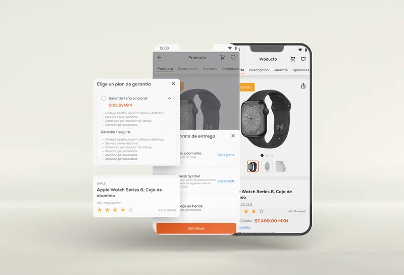
- Full-screen modal checkout, with financing and several shipping options
- Section for discounts and seasonal offers
- Warranties in plain sight when choosing the product
Gallery
How it turned out
Impact
What changed
- Better product discovery
- Less friction at checkout
- More visibility for promotional campaigns
Other case studies
- Case 02 Entertainment and events · marketplace
Suite and ticket marketplace
BeforeSlow event searchAfter Integrated search with filters - Case 03 Travel and loyalty
Latin American airline
BeforeFragmented sign-in and registrationAfter Unified sign-in and registration on a single screen - Case 04 Food and beverage · analytics
Multinational food company
BeforeDashboards by department and region without a common standardAfter Visual hierarchy and clarified key metrics - Case 05 Financial services · web platform
Real estate financing
BeforeContent changes that took one to two weeksAfter Content updates in minutes, from the Strapi console
Does your case look like this one?
A person on our team will reply.